Wayfinding Signage for Sacramento Offices, Clinics, and Shared Campuses
Custom wayfinding signage combining oak wood, vinyl lettering, and bold color accents for Sacramento offices, clinics, and multi-tenant buildings that need navigation to feel intentional.
Key takeaways
- Wayfinding signs do more than guide; they reduce friction for visitors and reinforce the tone of the building.
- Oak wood combined with vinyl lettering lets you mix permanent location details with flexible tenant or department names.
- Standoff mounting elevates the sign from the wall, adding dimension and improving visibility in shared corridors.
- A clean material system works well for Sacramento offices, clinics, and shared commercial campuses where navigation and presentation both matter.
Wayfinding signage helps employees, patients, clients, and visitors navigate complex interiors, but it also shapes how a building feels. In Sacramento offices, clinics, and multi-tenant commercial spaces, well-designed wayfinding reduces confusion, reinforces brand standards, and makes shared environments feel more considered.
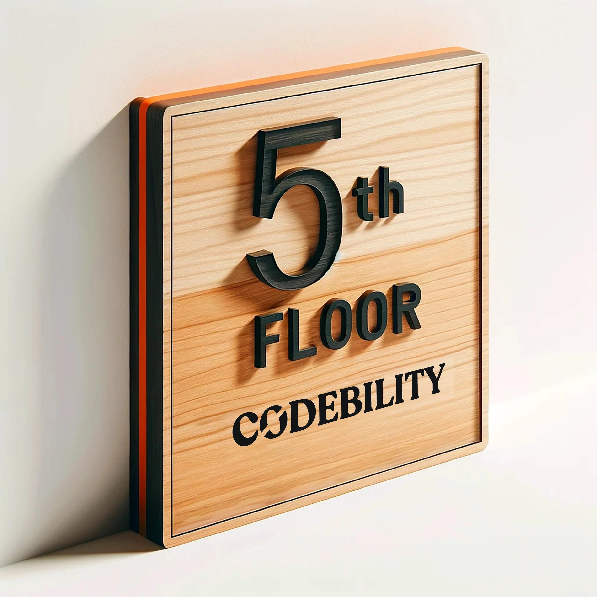
Here, we showcase a custom wayfinding sign built from oak wood with vinyl lettering and bold orange and black accents. The same approach works well for office suites, professional services, healthcare spaces, and other Sacramento interiors that need navigation to be clear without looking generic.
What makes wayfinding signage effective?
Effective wayfinding helps people find their way effortlessly. According to YAROOMS, wayfinding signs fall into four categories: directional (guiding the way), informational (giving context), identification (labeling spaces), and regulatory (rules and safety). This sign is an identification type, showing visitors what floor they’re on and which tenant occupies the space.
Good wayfinding signs share key qualities: they are visible from afar, easy to read quickly, and harmonious with the surrounding environment. In Sacramento offices and shared buildings, that usually means clean design, durable materials, and contrast that reads well under mixed daylight and interior lighting.
Materials: Why oak wood and vinyl?
Oak is a sturdy hardwood with a warm, natural grain that adds texture and character. It holds up well in busy commercial settings and accepts stains and paints beautifully. For permanent details like “The Fifth Floor,” we routed black-stained wood letters directly into the surface, making them a lasting feature.
For tenant names such as “Codebility,” we applied removable vinyl lettering. Vinyl is ideal for multi-tenant buildings because it can be peeled off and replaced easily when tenants change. Combining permanent and changeable elements on a single sign reduces costs and speeds up updates.
Design details: Color, contrast, and edge treatment
The sign’s edges are painted a vibrant orange, accented by a thin black inset line routed around the perimeter. This design choice:
- Grabs attention. The bright orange edge makes the sign noticeable from down the hallway, helping visitors find it sooner.
- Adds dimension. The black inset line creates a subtle shadow effect, giving the sign a refined, three-dimensional feel.
These colors create a strong read without turning the sign into visual noise, which is useful in buildings where wayfinding has to work alongside tenant branding and existing interior finishes.
How we mounted it: Standoffs for enhanced visibility
The sign is installed using metal standoffs that raise it about an inch off the wall. Standoff mounting offers several benefits:
- Improved visibility. Elevating the sign makes it easier to see from different angles in busy corridors.
- Added depth. The gap between sign and wall creates shadows that add visual interest.
- Clean appearance. Standoffs hide mounting hardware, keeping the sign’s front clean and uncluttered.
Proper installation requires precise hole placement and appropriate fasteners for your wall type. We provide professional installation services to ensure your signage is mounted perfectly the first time.
Why this approach suits Sacramento offices and shared buildings
Many Sacramento offices, clinics, and commercial campuses operate in mixed-use interiors with open layouts, glass walls, and rotating tenants or departments. This sign system works well because it is:
- Warm yet professional. Oak adds natural warmth, while bold colors inject energy.
- Flexible. Vinyl tenant names can be updated quickly without replacing the entire sign.
- Brand-aligned. The design can be tailored to reflect your building or tenant brand without making the navigation harder to read.
A well-crafted wayfinding sign tells visitors the building has been thought through. That matters whether the visitor is walking into a law office, a wellness clinic, a private school office, or a multi-tenant commercial floor.
What to consider when ordering wayfinding signage
Planning wayfinding signage for your Sacramento interior? Keep these points in mind:
- Which elements should be permanent? Decide what stays fixed (floor numbers, building name) versus what needs to be changeable (tenant names, room labels).
- Where are the key decision points? Place signs at entrances, elevator lobbies, and hallway intersections where people need direction.
- How far will viewers be? Choose text size and color contrast based on typical viewing distances.
- What wall materials are involved? Mounting hardware varies depending on drywall, concrete, glass, or other surfaces.
We’re happy to discuss your options during a project consultation. Start a project with Sactown Signco to get started.